Getting Started
The Mapping Broadband Health in America tool immediately puts you in the driver’s seat. This page will help you get started with three simple steps you can follow to begin exploring the map’s features. In addition, the Quick Start Tutorial provides more in-depth guidance, including screenshots and step-by-step instructions on how to use the map.
STEP 1: Understand the Map Organization
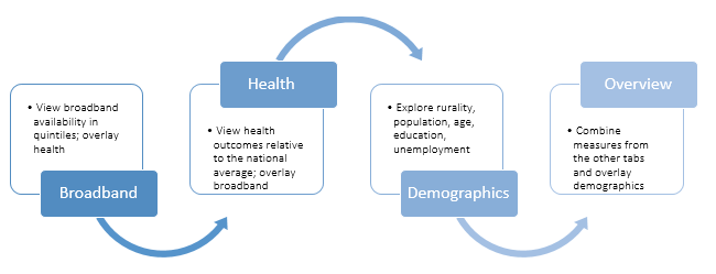
 The mapping tool is divided into four sections: Overview, Broadband, Health, and Demographics. You can start to engage with the map in any of these sections, but to explore broadband and health data, start with the Broadband or Health tabs. Each of these tabs allows you to explore the data in different ways. The Demographics section provides additional information on various demographic factors across the country, including rurality, population density, age, unemployment, and education.
STEP 2: Define What Are You Looking For
To explore broadband and health, first determine what information you would like to display. Are you curious about the broadband health statistics in your county or surrounding counties? Do you want to learn more about a specific broadband or health measure across various locations? Or are you looking for connected health gaps or areas of opportunity?

Start with the Broadband Tab if ...
... you’re interested in looking at the picture of broadband in a particular area. These maps display varying levels of broadband availability in color-coded quintiles -- 0-20%, 20-40%, 40-60%, 60-80%, 80-100% broadband access. You can also apply a health filter, such as obesity or physician access. The map will dynamically identify the areas that meet the selected health filter and then visualize broadband availability in only those areas.
Start with the Health Tab if...
...you’re interested in looking at the picture of health through a broadband lens. These maps show various health measures across the nation at the state and county levels. You can also apply a broadband filter (e.g., less than 30% access to broadband). The map dynamically identifies those areas that meet the selected broadband filter and then shows the selected health measure -- from low to high incidence -- in only those areas.
Use the Overview Tab to...
...put all the pieces together and to visualize the interplay of broadband measures with health. You can use “slider bars” to exercise greater control over what the map displays, setting your own parameters for various broadband, health and demographic measures. Only regions that match the selected parameters are shown. Areas meeting the broadband parameter appear as blue; those meeting the health parameter appear as pink; and those matching both parameters appear as purple.
STEP 3: Apply Advanced Map Features to Generate Custom Maps
In addition to displaying basic broadband and health information, the map contains other features that allow you to customize map information and share it with others. For a more comprehensive listing of map features, view the Quick Start Tutorial. Here are a few examples to get you started.
Toggle State and County Level Information:
 Click on the Stack Tool in the upper left hand corner (below the + and – zoom buttons) to change from state view to county view.
When you select county level, the map updates dynamically and applies your selections to a nationwide county level map. Doing this often shows patterns that might not be as clear at a state-level view. Drilling down to the county level also allows you to see greater differences within a state. You can then zoom in to focus on particular counties within a state. Once you click on a state and/or county, the statistics for that location will dynamically generate on the right.
Compare rural and urban areas:
 The Overview, Broadband, and Health tabs give you the option to apply a Demographic Filter for rurality (at different percentages like >50% or 0-20% rural) based on U.S. Census data. This allows you to isolate patterns that might affect rural and urban areas differently.
Share What You’ve Found
Each customized map generates a unique, dynamic URL or web link to help you share the map that you’ve created. This feature serves as a good collaboration tool as you formulate strategies and discern insights from the data. Once you’ve created a map that you want to share, copy and paste the link displayed at the top of the mapping tool and email, text or share on social media. With a single click, the recipient will be able to see the map you’ve created.
These are just a few of the customization options and capabilities of the Mapping Broadband Health in America tool. Our Quick Start Tutorial provides additional information and walks you through the mapping tool to maximize your experience.
View our FAQs.